Sunday 24 March 2013

Part Two: Observation in nature


Project: Still Life

This still life drawing of natural objects was done for the previous section. I have shown it again here as a starting point for this next section.


The following work explores ways of drawing natural objects....


Drawing in dots and squiggles

  
Exercise: Still life line drawing

Exercise: Still life group in tone
                     

Project: Drawing fruit and vegetables

Exercise: Using hatching to create tone
Comment  I find soft pastels the easiest colour medium for drawing. One can manipulate, blend, overdraw and correct. It's good for large sweeping strokes covering big colour areas but also can be used for details especially with pastel pencils or the harder conte type. It can also be used with turpentine as a solvent to get painterly effects.On the negative side the colours can be a bit dull if overworked or if the quality is not the best. Also the work tends to be predictable and does not lend itself to the 'happy accidents' that can enliven works in ink or other liquid medium.


Exercise: Using pen and ink
Comment  I have done very little work in ink and am new to coloured inks but I am quite excited by this  medium. The colours are really bright and glowing and can be used in different ways... line, splashes, painted areas etc. I am still learning how to exploit the qualities of ink and have bought a set of dip pens to experiment.

Exercise: Using oil pastels
Comment I had previously tried to use oil pastels but found them very rough and difficult to use. However I have since learnt how to use solvents and more suitable paper and am very pleased with the bright colours that are produced and the effects that can be achieved by combining colours in different ways. On the downside there is a limit on adding layers as the surface gets too smooth and without a 'tooth' the pigment doesn't stick, also oil pastels are not great for fine detail. 

Project : Drawing Plants and Flowers


Pencil drawing


Using coloured pencils

Comment  Colour pencils can produce drawings of great delicacy but I find that doing large drawings with this medium can be very time consuming and even tedious. I spent hours on this drawing and the final results are not that great. In particular I found it difficult to get good light and dark contrasts. However, for small detailed drawings colour pencils could be a great solution.


Drawing with other media  (soft pastel and ink)

Project: Drawing Animals

Exercise: Grabbing the moment


Comment  I did these charcoal sketches at a local farm zoo in Edinburgh. I like drawing animals and charcoal is one of my favourite mediums so this exercise was very enjoyable.  


 Drawing in water soluble pencils


 Comment   I enjoyed this assignment. Water soluble pencils are a great medium for small drawings like this. Subtle effects can be produced by adding water and are used here to show the incremental colour changes on the fish.


Assignment Two   

First step -  Deciding on the composition.

I experimented with some fruit and flowers to find an arrangement that felt right and then did a preliminary sketch with pastels.

This first sketch gave the impression that the arrangement was a bit squashed so I tried again with a portrait format.

Second sketch
This worked better but I felt the plant and the pineapple combined was too much so decided to replace the plant with a bottle.

Assignment Two Drawing

 I first painted the basic layout in acrylic over paper that had been primed with gesso.  This was quite a good idea because it was easy to amend the composition until it felt right. When I was satisfied with the arrangement I drew into the painting with oil pastels. I am relatively pleased with the outcome but I spent far too long on it and got overly caught up in the detail.
                   
Assignment Two


Overall Summary   I generally enjoy still life but I found the exercises in this section too prescribed and the requirements didn't leave enough decision making to the student. I would have liked more encouragement to use my creative imagination. I have done a lot of rather conventional of still life drawing before so the subject matter wasn't new. In retrospect I should not have followed the instructions so rigorously and should have tried some more contemporary and adventurous interpretations of the subject matter. I will try to do this in the next section.

Tuesday 24 January 2012

Assignment One

 Still Life of Natural Objects

I am now doing my first assignment for evaluation by my tutor. The brief is to produce two still life works with preparatory drawings in different media. The first work is to be comprised of natural objects. I chose some shells, leaves, pine cones and a piece of wood and move them around until I found an arrangement which pleased me and then proceeded to do a first version in pen and ink. I started by using a bamboo stick to get a natural looking line but this was difficult as there was either too much ink or too little. Though the lines were pleasing in themselves I gave up and moved to using a pen and at times a brush. The drawing got rather messy in the lighter areas so I painted these over with white acrylic and drew them over again. I was quite pleased with the end result. I have rarely used ink as a medium but will aim to do this more often. I like the strong contrasts which are produced.

Pen and Ink Drawing


The next work was a drawing of the same arrangement using soft pastels, pencil and white acrylic paint.

                                                              Soft Pastel Drawing


The last drawing in the series was done in charcoal and white chalk.

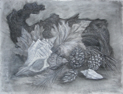
Still Life with Charcoal and white chalk
The drawings took me much longer than was suggested in the brief. I find it hard to complete work in one session. I need to leave it in order to come back with a fresh eye to address parts that don't work that well.  I tend to rework several times and get a bit over concerned with details and the work is liable to lose it's freshness.

For the second still life work with man made objects, I chose an Indonesian puppet, a bottle and  a Moroccan teapot. I found an arrangement that seemed to work and did some sketches.


This didn't feel like enough objects so I added a wine glass and did another quick sketch.


This worked much better so I started a drawing in charcoal on A2 paper.

                                      Charcoal Still Life with Puppet etc.

I liked this one as it was a bit looser than the previous work. I followed it with a drawing in soft pastels.

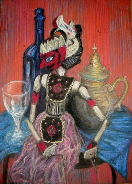
    Still Life with Puppet in soft pastels


I feel I overworked this drawing. My intent was to produce something a bit more interpretive but I got sucked into the realistic approach again. The pastels I have are not the best quality and I went over the drawing quite a lot to try to strengthen the colour and contrast but with dubious success.

In doing this work I have realised how important it is to use the appropriate paper for the medium. My charcoal drawings were done on smooth cartridge paper and it was hard to get the contrast I wanted and the drawing was very easily smudged. I used a rougher paper for the soft pastel drawing and it was much easier to control.

Overall, though I am quite pleased with my assignment drawings, I feel my approach was too literal and fussy. These are habits of a lifetime that I want to break free from in order to move to a looser more interpretive style. I have been looking at the work of other students and some are doing really exciting original and contemporary work. I hope to move in this direction in the next assignment.


Before winding up this first assignment I decided to try a more interpretive approach and tried some cubist style pencil sketches.......


I then did an A1 size under-painting in acrylic and when I was satisfied with the compostion (intended to give an impression of the puppet springing into life) I worked into it with graphite pencil and pastels. The pastels adhered quite well to the acrylic especially after spraying the surface with fixative.

Cubist style puppet drawing

                           
I'm now going to take my assignment work to the post office to send to my tutor. Hope it arrives intact!

Tuesday 29 November 2011

Drawing 1: Projects prior to Assignment 1


November 28th, 2011
I have just started the OCA Course, Drawing 1 and this is my Learning Log for recording my progress. I have done several art courses previously and I am hoping this course will consolidate my experience and help me to find new and more original ways of making art.

Project: Mark-making and Tone
 
Although I have been drawing for many years I had never really experimented much with holding the drawing tool in different ways. When I did this I found it made a difference in the emphasis of the mark. Holding it at the end or on it's side tended to make a looser, softer mark. The amount of pressure was the most important factor but many variations of marks can be achieved in other ways. 

I enjoyed experimenting with different media:  graphite pencil, pen, charcoal, oil and soft pastels, coloured pencils and combinations of all these. Charcoal makes a softer more sculptured look with big tonal contrast, pen is more dramatic and pencil is very versatile and can be used either aggressively or delicately. Colour adds another dimension which can divert attention from the form of the marks themselves to the play of colour. The subject matter would determine the best choice of style. When doing the doodles I found it helped to have an image or emotion in the back of my mind.
Different shading experiments


Charcoal


Mixed media experiments


 Research Point:  Van Gogh Drawing

I looked up Van Gogh on the Wikipaintings.org website and was enthralled by the number of drawings I found, most of which I hadn't see before. In all there were nearly 2000 works to see and looking at them in chronological order one could observe the development of his artwork. I was amazed at the number of works he produced in such a short span of time.  He was very skilled in using different kinds of marks and lines to express the atmosphere of the subject matter.

 Rocky Ground at Montmajour -Vincent van Gogh


Project: Basic shapes and fundamental form
 
I found the exercise of drawing a heap of books more difficult than I anticipated. Getting all the angles right needed careful observation.  I went on to do the 'Jars and bottles' exercise, first carefully in pencil and then very quickly in felt pen. I did a coloured 'Supermarket shop' still life using soft pastel which I felt was successful. The proportions were right and the composition wasn't bad.

Books and box


Jars and Jugs


 Quick sketch with felt tipped pen 
Supermarket Shopping


Project: Tone and Form

Tonal Study in Pencil

Research point  -  Odilon Redon

Odilon Redon (1840-1916) was a French artist who was best known for his symbolist paintings.
Quoting from Wikipedia....

'Redon described his work as ambiguous and undefinable.
"My drawings inspire, and are not to be defined. They place us, as does music, in the ambiguous realm of the undetermined."
He wanted to "place the visible at the service of the invisible". His process was explained best by himself when he said:"I have often, as an exercise and as a sustenance, painted before an object down to the smallest accidents of its visual appearance; but the day left me sad and with an unsatiated thirst. The next day I let the other source run, that of imagination, through the recollection of the forms and I was then reassured and appeased."'


I personally like his work very much. Some of it is very grotesque and the stuff of nightmares, particularly his black and white drawings. Other work, mainly done in coloured pastels, is delicate with a pleasing use of colour. He produced some very fine flower paintings as well as symbolist genre works.
 
                                     
                                     The Mystical Knight - Odilon Redon   

                                       The Laughing Spider  - Odilon Redon       

                                         Flight into Egypt - Odilon Redon


Project Reflected Light

Charcoal is good for producing the strong contrasts and highlights which make the drawings more interesting. It requires careful observation to delineate the many shades of light and dark. When drawing shadows and reflections it's necessary to think about where the light is coming from whether it's the primary source or reflected light.

                        
                           Exercise: Study of light reflected from one object to another.


                                 Exercise:  Shadows and reflected light and shade


Negative and Positive Space

Research Point - Patrick Caulfield 1936-2005

Patrick Caulfield had a distinctive style using flat areas of colour and black lines to simplify his subject matter to it's most basic form.  The style was much like a sign painter or illustrator.  I like his clean crisp forms and find them mentally refreshing and clarifying.


                              Still Life by Patrick Caulfield

           
                    White Ware screen prints by Patrick Caulfield


Drawings in the style of Caulfield's White Ware


    Project Still Life

      Exercise: Still Life sketches of made objects


Exercise: Sketches of natural obejects


Exercise: A Drawing with textures